design portfolio
logo design and branding
We understand how crucial good logo design and branding are to your business.
Read more...
A logo is an integral part of your overall brand – an easily recognisable symbol that identifies your business or product. Your logo is usually the first impression that people get of your business or organisation, appearing on your promotional literature, website, social media, emails and business stationery.
It is essential that your logo design is visually pleasing and carefully thought out. All your business branding originates from the logo – colour, typefonts, style, so it’s important you get it right in order to stand out from the crowd.
Before we begin your logo design, we take the time to get to know your business – working closely with you, we can create a logo that delivers for you and your business. We have over 20 years experience in both logo design and branding.
Below is a selection of some of the logos and branding we have created. Please tap or click each image to get a brief description of each logo concept.
Check out a more in-depth look at some of our branding projects here.
We understand how crucial good logo design and branding are to your business.
Read more...
A logo is an integral part of your overall brand – an easily recognisable symbol that identifies your business or product. Your logo is usually the first impression that people get of your business or organisation, appearing on your promotional literature, website, social media, emails and business stationery.
It is essential that your logo design is visually pleasing and carefully thought out. All your business branding originates from the logo – colour, typefonts, style, so it’s important you get it right in order to stand out from the crowd.
Before we begin your logo design, we take the time to get to know your business – working closely with you, we can create a logo that delivers for you and your business. We have over 20 years experience in both logo design and branding.
Below is a selection of some of the branding we have created. Please tap each image to get a brief description of the logo concept.
Check out a more in-depth look at some of our branding projects here.
other branding projects
get in touch
We can create a new or revamped identity for your business, organisation or product with unique, consistent branding that will help you stand out from the crowd.
get in touch
We can create a new or revamped identity for your business, organisation or product with unique, consistent branding that will help you stand out from the crowd.
AquaNu
CLIENT: AQUANU FILTRATION SYSTEMS LIMITED
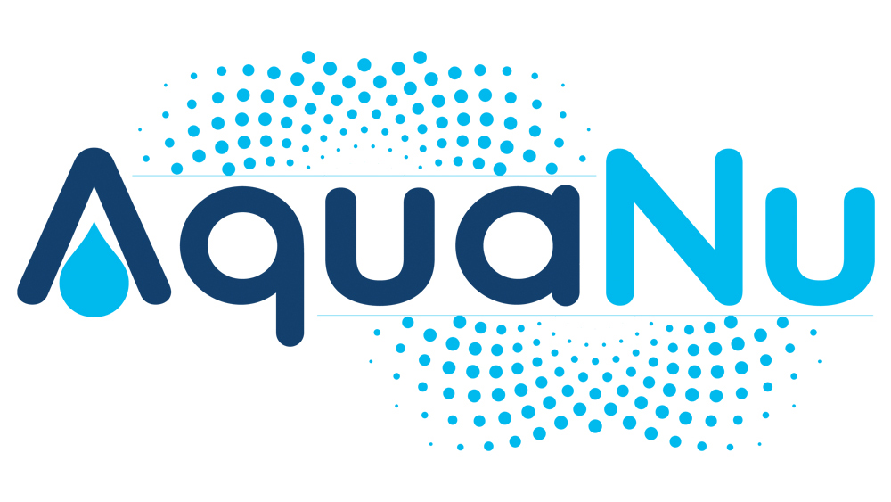
AquaNu is the creator of StayPure, a unique advanced high porosity ceramic technology for the purification of tap water. The arrangement of the light dots represent the the water interacting with the porous ceramic and the droplet in the arch of the A represent the water purification technology.
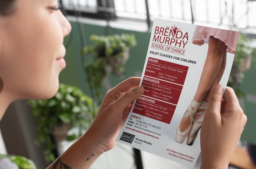
Brenda Murphy School of Dance
CLIENT: THE BRENDA MURPHY SCHOOL OF DANCE
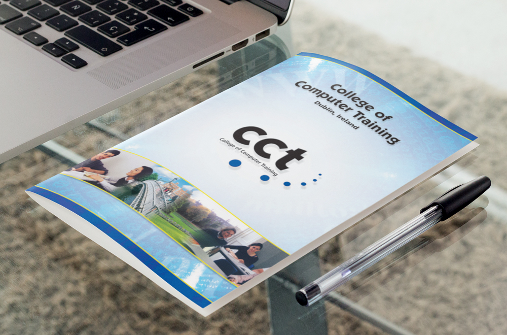
CCT
CLIENT: COLLEGE OF COMPUTER TRAINING
College of Computing Technology (CCT) Dublin is one of Ireland’s leading education institutions providing internationally recognised programmes in Computing, Information Technology, and Business.
The blue dots symbolise stepping stones representing the college’s role in delivering a clear, defined career path to its many students.
Ice Cream & Treats Extravaganza
CLIENT: MARTIN FOOD EQUIPMENT
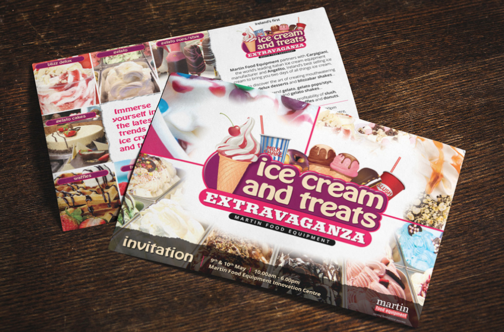
The Ice Cream & Treats Extravaganza was a trade show organised by Martin Food Equipment to showcase the latest in ice cream and dessert making technology.
The logo was given a colourful theme with illustrations of a wide variety of desserts/treats and featured very informal type styles to appeal to all ages.
James Byrne & Company
CLIENT: JAMES BYRNE & COMPANY CHARTERED ACCOUNTANTS

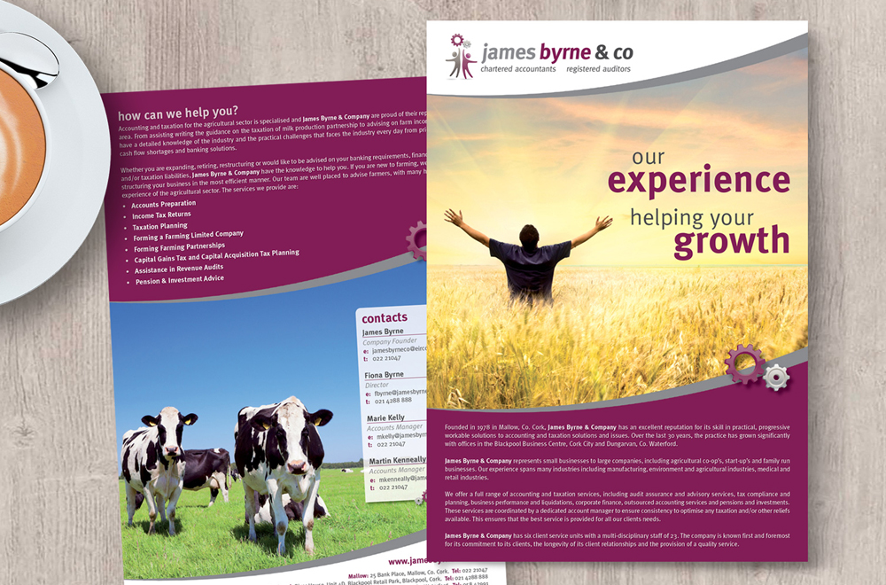
James Byrne & Company has earned an unparalleled reputation for its full range of accounting, auditing and taxation services.
We chose the symbolism of gears, representing progress, innovation and change, combined with an illustration of two people reaching up representing teamwork and co-operation.
The use of grey tones conveyed elegance and sophistication and the burgundy conveyed authority and wisdom.
LMK Executive Coaching
LMK Executive Coaching works with a broad range of individuals and organisations including, business owners, CEOs, senior managers, directors, team leaders and executives looking to become better leaders, develop new business ideas and new career opportunities.
We chose the symbolism of the owl, representing wisdom and prosperity. The use of cyan and grey tones conveyed elegance and sophistication.
Lough Rynn Harvest Festival & Vintage Day
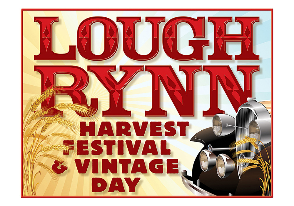
The Lough Rynn Harvest Festival & Vintage Day is an annual festival organised by the Bornacoola Development Association and Leitrim County Council.
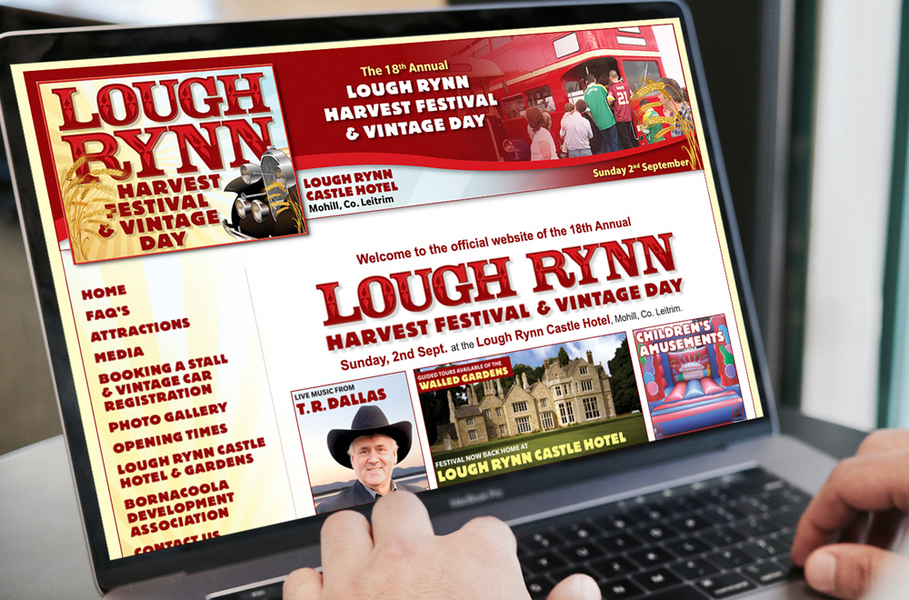
We created the logo and branding with a western and rugged style typefaces to give it a rustic feel and used warm colours such as red and burgundy to convey a warm summer feel, contrasting well with the wheat and vintage car illustrations.
Looney Tunes Funbooks
CLIENT: GENESIS / WARNER BROS.
The Looney Tunes Funbooks is range of activity packs for children containing a comic, poster, crayons, cutout bookmarks and masks and a small bag of marshmallows specifically for sale in duty free stores globally.
The logos were created in a disk format using character illustrations and a cartoon style typeface.
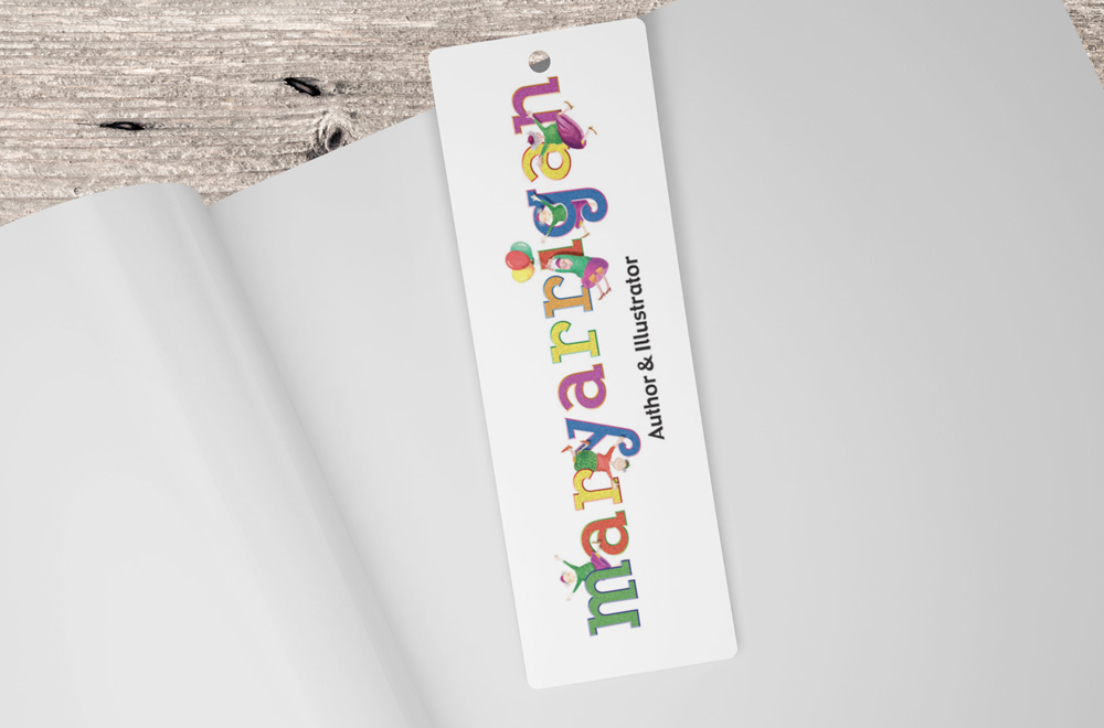
Mary Arrigan Author & Illustrator
CLIENT: MARY ARRIGAN

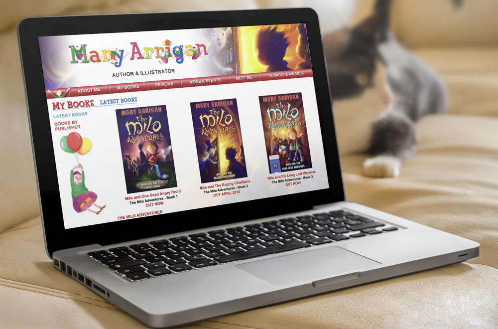
Mary Arrigan is a successful, international award-winning Irish writer and illustrator of 35 children’s books and writer of 17 books for teenagers.
We created the logo using a bright range of colours and a cartoon style typeface to convey that her work is mostly aimed at children. Her most famous character, Mamó, for An Gum publishers is featured in different letters of the logo.
MV Cill Airne
CLIENT: MV CILL AIRNE RESTAURANT & BAR
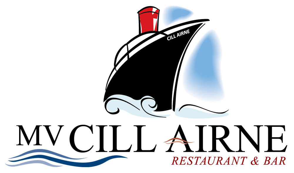
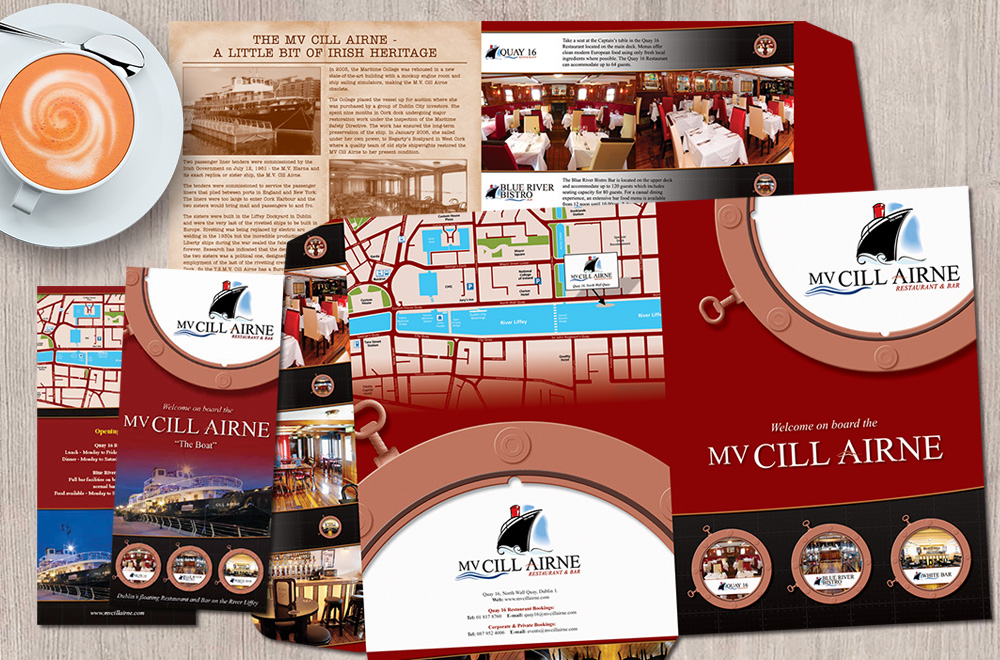
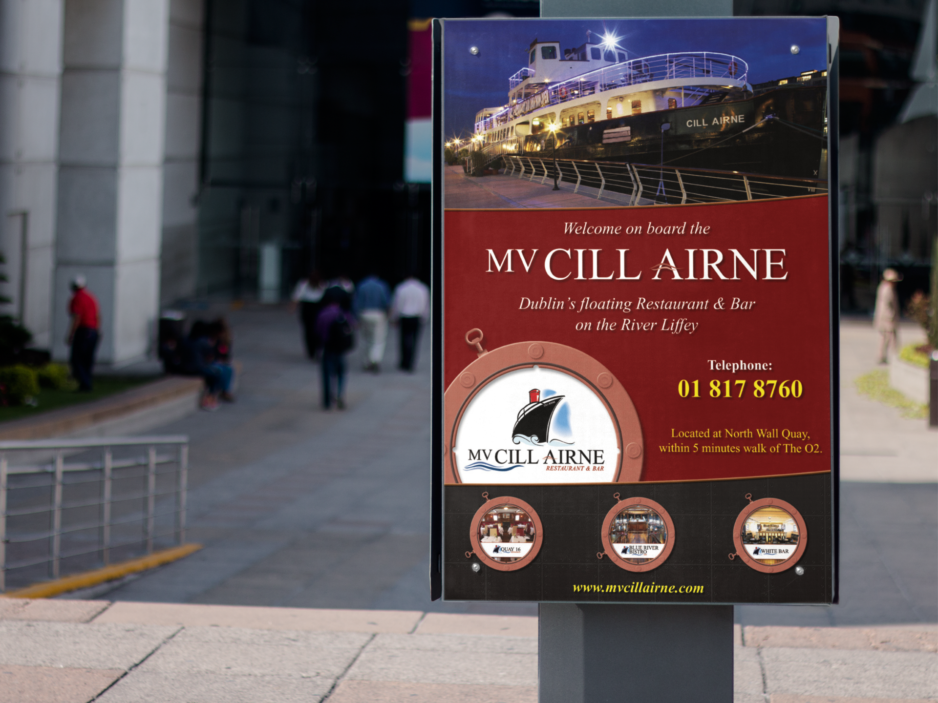
The beautifully restored MV Cill Airne tender boat on the Dublin Docklands features two bars and a luxury restaurant on board.
We created the main logo and subbrand logos using a abstract illustration of the boat with a formal serif typeface to convey its formal elegance. Waves representing the water are on the bottom left and through the A or E of the main logo and subbrand logos.

NOW Ireland
CLIENT: MURRAY CONSULTANTS / NATIONAL OFFSHORE WIND ASSOCIATION OF IRELAND
NOW Ireland, the National Offshore Wind Association of Ireland, is the representative body for enterprises developing offshore wind energy projects in Irish coastal waters.
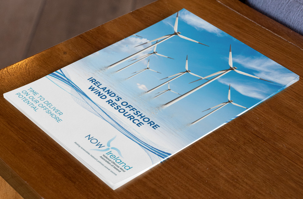
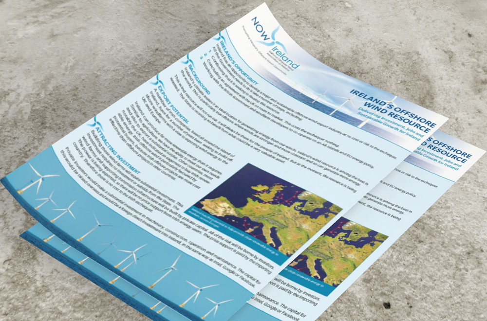
We created the logo using blue tones representing water and the wind turbine blades as the central holding construct for the logo. All text is in a modern, sans serif typefont.
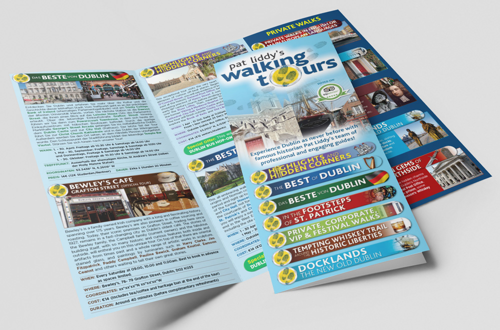
Pat Liddy’s Walking Tours
CLIENT: PAT LIDDY’S WALKING TOURS
Pat Liddy’s Walking Tours is an award-winning walking tour company with a host of well-trained and highly-acclaimed tour guides who share their passion for Dublin with visitors.
We created the logo using the Dublin navy blue for the title and a map icon disc with footprints as the central icon. The footprints continue behind the logotype to convey the walking aspect of the tours.
Síar A Rachas Múid Productions
CLIENT: SÍAR A RACHAS MÚID PRODUCTIONS
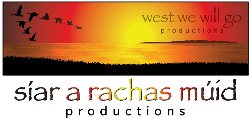
Síar A Rachas Múid Productions is an award-winning company working in film, television and video production activities. The Irish name translates to West We Will Go Productions, in reference to its origins in the west coast of Ireland.
We created the logo illustration of a sunset coastal scene looking over to the Aran Islands with a flock of geese flying westwards. The colours are oranges and yellows from the sunset and black as a framing device.
StayPure Water Purifier
CLIENT: AQUANU FILTRATION SYSTEMS LIMITED
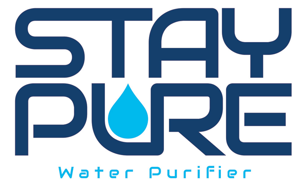
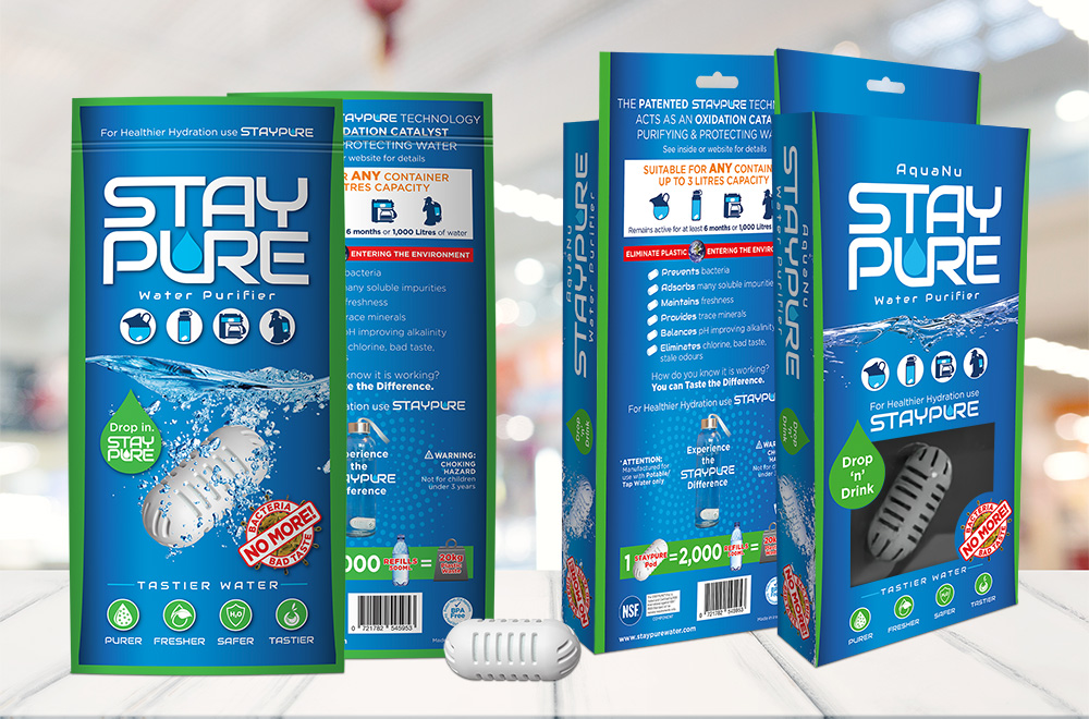
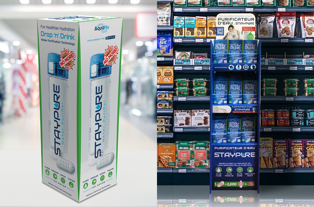
StayPure Water Purifier, by AquaNu, is a unique and very advanced high porosity ceramic technology for the purification of tap water.
The blue and cyan colours represent the the water and the droplet represent the purified drinking water in a cup or glass. The modern, futuristic typeface conveys the new purification technology associated with the product.
Stratford College
CLIENT: STRATFORD COLLEGE CO-EDUCATIONAL SECONDARY SCHOOL
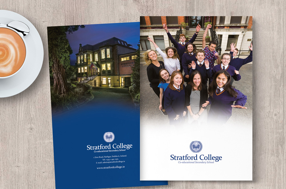
Stratford College is a co-educational fee paying secondary school in Rathgar, Dublin which welcomes students on a multi-denominational and no faith basis.
The 10 Commandments tablets represent the religions teaching in the school with the flame/torch signifing the purpose of education to serve as a beacon of light which enables one to see the path towards a bright future.
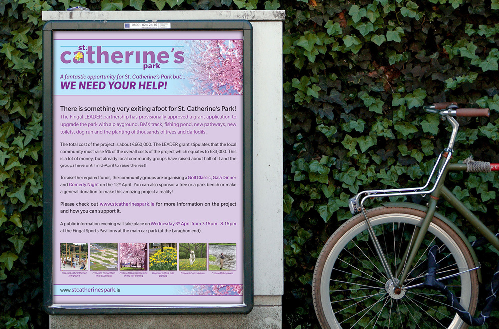
St. Catherine’s Park
CLIENT: FINGAL COUNTY COUNCIL

St. Catherine’s Park is a 200 acres of woodland and grassland and famed for its wide range of daffodils growing throughout the park. It provides a very tranquil setting for walking through a combination of historical association, scenic views and woodland and river.
The logo is created in the Fingal County Council purple and lilac colours with a small illustration of its famed daffodils within the lettering.
